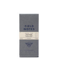
$12.95
FIELD NOTES AUTUMN TRILOGY
$12.95
FIELD NOTES AUTUMN TRILOGY
Out of stock
FIELD NOTES AUTUMN TRILOGY
LEGENDS OF THE FALL
Our Quarterly Editions aren’t necessarily tied thematically to the season in which they’re released, but every few years we feel compelled to head back into the woods for Autumn. “Mackinaw Autumn” (2009) and “Shenandoah” (2015) were beloved editions that made great use of the warm colors of fall foliage, but it felt like time to try a different twist.
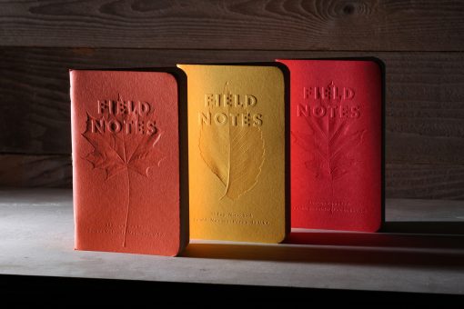
At a glance, Field Notes’ Fall 2019 “Autumn Trilogy” edition seems perfectly simple, but the subtly debossed leaves and embossed logo are the result of a very complicated process. First, we selected three beautiful cover papers from Mohawk’s Via line: “Warm Red,” “Safety Yellow,” and “Scarlet,” all with a vellum finish. These roughly approximate the Fall leaf colors of the North American Sugar Maple (Acer saccharum), the American Elm (Ulmus americana), and the Scarlet Oak (Quercus coccinea).
NEXT WE’D LIKE TO DO A FEW IMPRESSIONS FOR YOU
Using photographs for reference, we carefully traced the shape, contours and vein patterns of each leaf into a scaleable vector file, then created a “lock-up” of each cover layout with our logo and cover text. A sculptor at our diemaker converted the flat vector files into a three-dimensional computer model to evaluate the tolerances for embossing and debossing, and to simulate how the covers would look under various lighting conditions before the expensive and time-consuming process of physical diemaking began.
After reworking the files a bit, a master die was carved in precise detail into a brass plate on a CNC-machine, a ten-hour process for each design. Each master die was then painstakingly polished and inspected, and imperfections were cleaned up by hand.
When the masters were finished, “counters” were made by pressing the master into hot resin. The counter and master were then used to make the duplicates that were necessary to stamp the artwork on multiple locations on the press sheet.
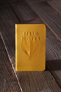
DIE ANOTHER DAY
While the dies were being made, we ordered some tests to determine the ink/varnish balance to best bring out the subtleties of the 3-D shapes. Too much of a tint would overwhelm the virtually “blind” emboss that we were after. Once we got on press, we found our tested balance was too strong, so our pressman suggested using the varnish without a tint. He was right, it was perfect. Pressmen know their stuff!
After a few tweaks to the dies (and biting our nails during the ensuing 10-hour waits) the varnish-printed cover stock was delivered to the embosser, the dies were carefully aligned to the varnished areas, and the sheets were stamped.
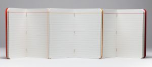
FALLING INTO PLACE
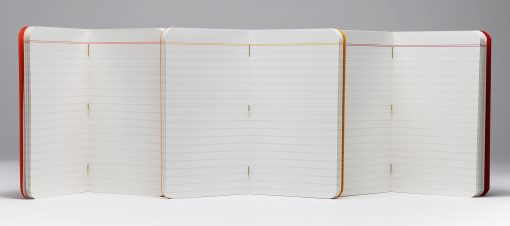
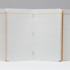
Meanwhile, ruled body pages were printed on Finch Fine 70#T “Soft White” in gray with double top rule matched to the cover colors. Finally the books were bound with gold staples.
The final result is wonderfully subtle at first glance, but a close look reveals a deeper complexity. That sounds like a pretty over-the-top way to describe pocket memo books, but we bet you’ll agree when they’re in your hands.
Product Categories
- Anderillium Inks
- Aston Leather
- Bastion
- +Benu Pens
- Blackwing Pencils
- Calligraphy
- Christmas Cards
- Col-o-ring
- Colored Pencils
- +ColorVerse Ink
- CursiveLogic
- +Diamine Ink
- +Diplomat
- +Endless
- +Esterbrook
- Exacompta
- +Faber-Castell
- +Ferris Wheel Press Inks
- +Flexbook Notebooks
- Flip Notes by Wellspring
- Fountain Pen Ink Cleaner
- FreshCut Paper
- Gina B Designs
- Girologio Leather
- J Herbin Fountain Pen Ink
- Kakimori
- Kartos Italian Stationery
- Kaweco Pens
- Laban
- Lang
- Leather Accessories
- +Leonardo Pen
- Letter Openers
- Lochby
- +MonteVerde Fountain Pen Inks
- MonteVerde Monza Fountain Pens
- +Nahvalur Pens
- Nebula Notebooks
- Noodlers Ink
- +Notebooks
- Online Pens
- Parafernalia
- Pen Cases
- Pepin Letter Writing Sets
- +Peter Pauper Press
- Pilot Iroshizuku Ink
- +Pineider Pens
- +Pineider Stationery
- +Platinum Pen
- Presidential Pen
- +Private Reserve Ink
- Recife Leather
- +RollerBall Pens
- +Sailor
- Schmidt
- +Schneider Pens
- Sensa Pens
- +Stationery
- STICKII
- Tomoe River Paper
- Travelers Notebook
- TWSBI
- +Visconti
- Wellspring
- Worther
- Write Notepads & Co.
- A & W
- +Acme Writing Tools
- +BallPoint Pens
- +Caran d’Ache
- +Clairefontaine
- Colouring Books
- +Crane & Co. Stationery
- +Cross
- Field Notes Brand Notebooks
- +Fisher Space Pen
- +Fountain Pen Ink
- ColorVerse Ink
- Diamine InkVent bottled ink
- Diamine Shimmer Ink 50ml Bottle
- Faber-Castell Ink
- Ferris Wheel Press
- J Herbin Scented Inks
- Jacques Herbin 1798 Inks
- Lamy Crystal Inks
- MonteVerde 12-pack Ink Cartridges
- MonteVerde 30ml Bottled Inks
- MonteVerde 30ml Gemstone Bottled Inks
- MonteVerde 30ml Noir Bottled Inks
- Parker Quink Fountain Pen Ink Cartridges
- Pilot Parallel Pen Ink Cartridges
- Platinum Bottled Fountain Pen Ink
- Platinum Fountain Pen Ink Cartridges
- Sailor Fountain Pen Inks
- Sailor Manyo Inks
- Visconti Inkwell Collection
- Caran d’Ache Bottled Fountain Pen Ink
- Diamine Ink 80ml Bottle
- Diamine Ink Cartridges
- J Herbin 1670 Anniversary Ink
- J Herbin 30ml Bottled Ink
- Pelikan Ink Cartridges
- Lamy Fountain Pen Ink
- Noodlers Ink
- Pelikan Edelstein
- Pilot Iroshizuku
- Pilot Ink Cartridges
- Private Reserve Ink
- Sheaffer Skrip Fountain Pen Ink Cartridges
- Waterman Fountain Pen Ink
- +Fountain Pens
- Benu Pens
- Calligraphy Fountain Pens
- Faber-Castell
- Kaweco Fountain Pens
- Lamy
- MonteVerde Monza Fountain Pens
- Namiki
- Pelikan
- Pilot
- Pilot E95S
- Pilot Vanishing Point Decimo
- Pilot Vanishing Point Fountain Pens
- Pineider Pens
- Platinum
- Platinum Curidas
- Platinum Preppy Wa
- +Sailor
- TWSBI
- +Visconti
- Flex-Nib Fountain Pens
- Fountain Pen Gift Sets
- Pilot MR-Metropolitan Fountain Pens
- +Journals
- Kyocera Ceramics
- Lady Jayne
- +Lamy
- LePen
- Leuchtturm 1917
- Luxury Writing Instruments
- M+R
- Mechanical Pencils
- Michel Design Works
- Microfiber Cleaning Cloths
- +MonteVerde
- +Namiki-Pilot
- Namiki Nippon Art
- Namiki-Pilot Falcon
- Namiki/Pilot Custom 74
- Pilot Custom 743
- Pilot Custom 823
- Pilot Custom Heritage 912
- Pilot Custom Heritage SE
- Pilot E95S
- Pilot Iroshizuku Ink
- Pilot Vanishing Point Decimo
- Namiki-Pilot Accessories
- Namiki-Pilot Vanishing Point Collection
- Namiki-Pilot Vanishing Point Nibs
- Note Block
- Notepads
- +Pelikan
- Pen Refills
- Pencil Sharpeners
- +Pilot Pens
- Pilot E95S
- Pilot Enso
- Pilot G2 Mini Pens
- Pilot Highlighters
- Pilot Iro-Utsushi Dip Pens
- Pilot Iroshizuku Ink
- +Pilot Parallel Calligraphy Pens
- Pilot Pen Refills
- Pilot Vanishing Point Decimo
- Namiki Accessories
- Pilot Better BallPoint Pens
- Pilot Better Retractable BallPoint Pen
- Pilot Bravo! Marker Pens
- Pilot Creative Permanent Marker Pens
- Pilot FineLiner Marker Pen
- Pilot FriXion
- Pilot G-Tec-C
- +Pilot Metropolitan Pens
- Pilot P-500 and P-700
- Pilot Pen Accessories
- Pilot Pen Pouches
- +Pilot Pens Dr. Grip
- Pilot Permanent Marker Pens
- Pilot Precise
- Pilot Precise Grip
- Pilot Precise V5 and V7 Pens
- Pilot Precise V5 RT and V7 RT
- Pilot Razor Point and Razor Point II Pens
- Pilot V Razor Point Pens
- Pilot Varsity Fountain Pen
- Pilot VBall Grip
- Pilot VBall Pens
- Pilot VBall RT
- Pilot Permanent Marker Pen
- Planners
- Plastichange
- +Retro 1951
- +Rhodia
- Rotring
- SALE
- +Sheaffer
- Sherpa
- St. Tropez Petite 2-in-1 Stylus & Pen
Product tags
Search Products
Contacts
2488 NORTH LANDING ROAD UNIT 112
Virginia Beach
VA
23456
PHONE: 757-427-1887
pam@apenloversparadise.com

